
Over the years there have been countless attempts to redesign the craigslist interface by incorporating everything from the 2000s Web 2.0 aesthetic to anti-skeuomorphic design. Philanthropic designers have spent hours rewriting the HTML and CSS to incorporate web standards and re-coding the site for responsive conformity. Creative experts have refined the user experience down to a limited set of menus and buttons in the sacred name of minimalism.
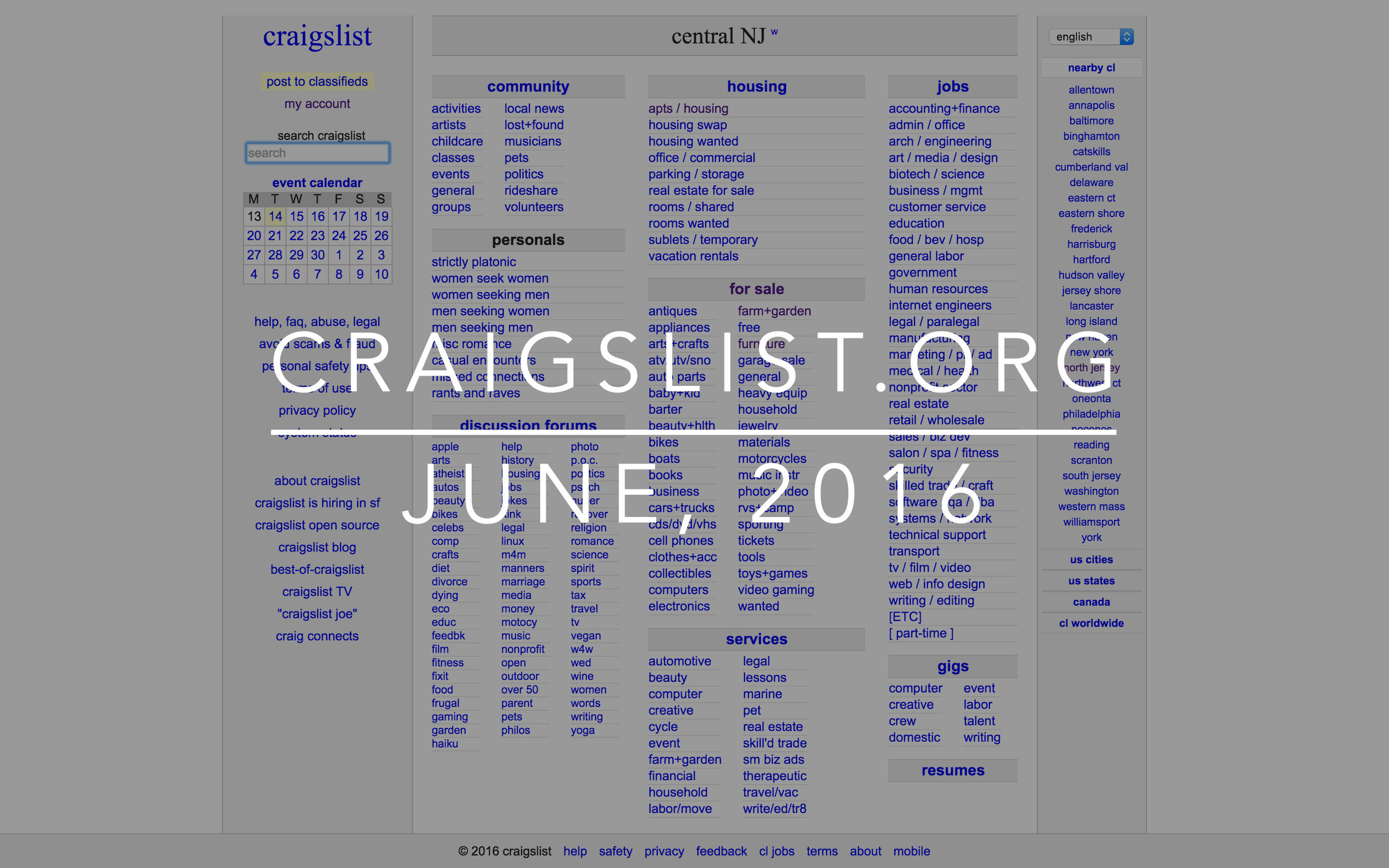
To this day, the official Craigslist design remains largely unchanged. And let's be honest, unless something drastic happens, Craigslist will probably never redesign.
But consider for a moment the size of the beast that is Craigslist, the nature of its community, and its stranglehold on society. It is evident that Craigslist needs not conform to a contemporary corporate design paradigm. Rather, Craigslist should double-down on its defining characteristic.

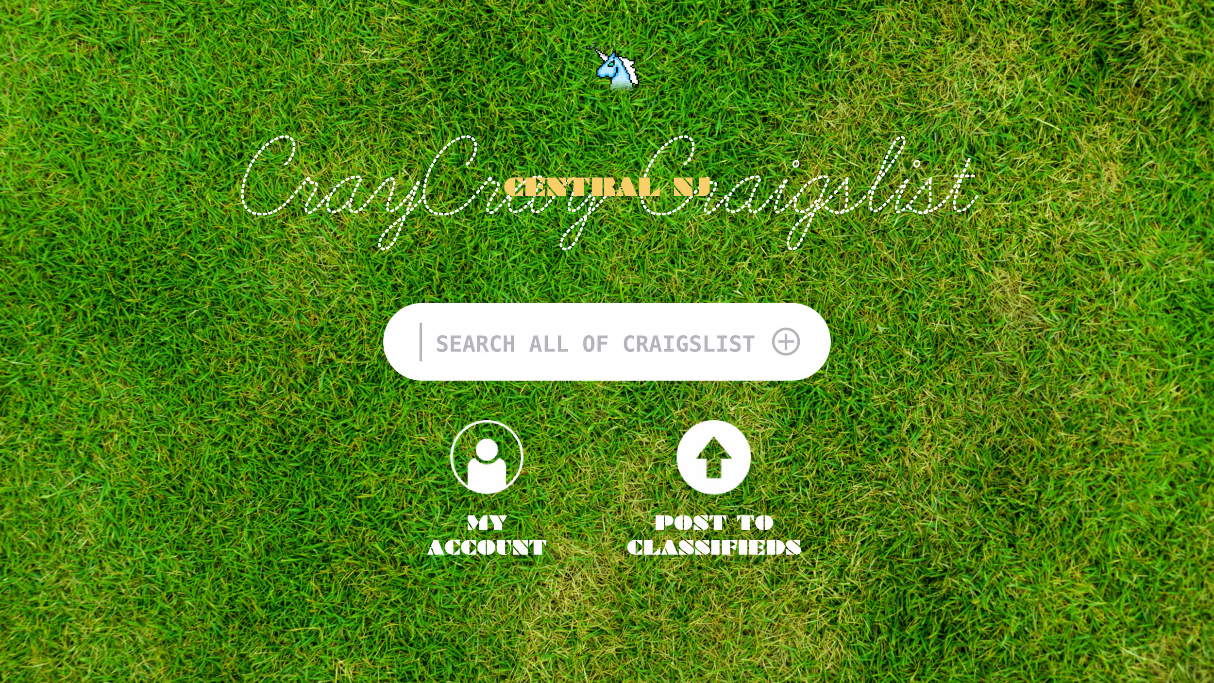
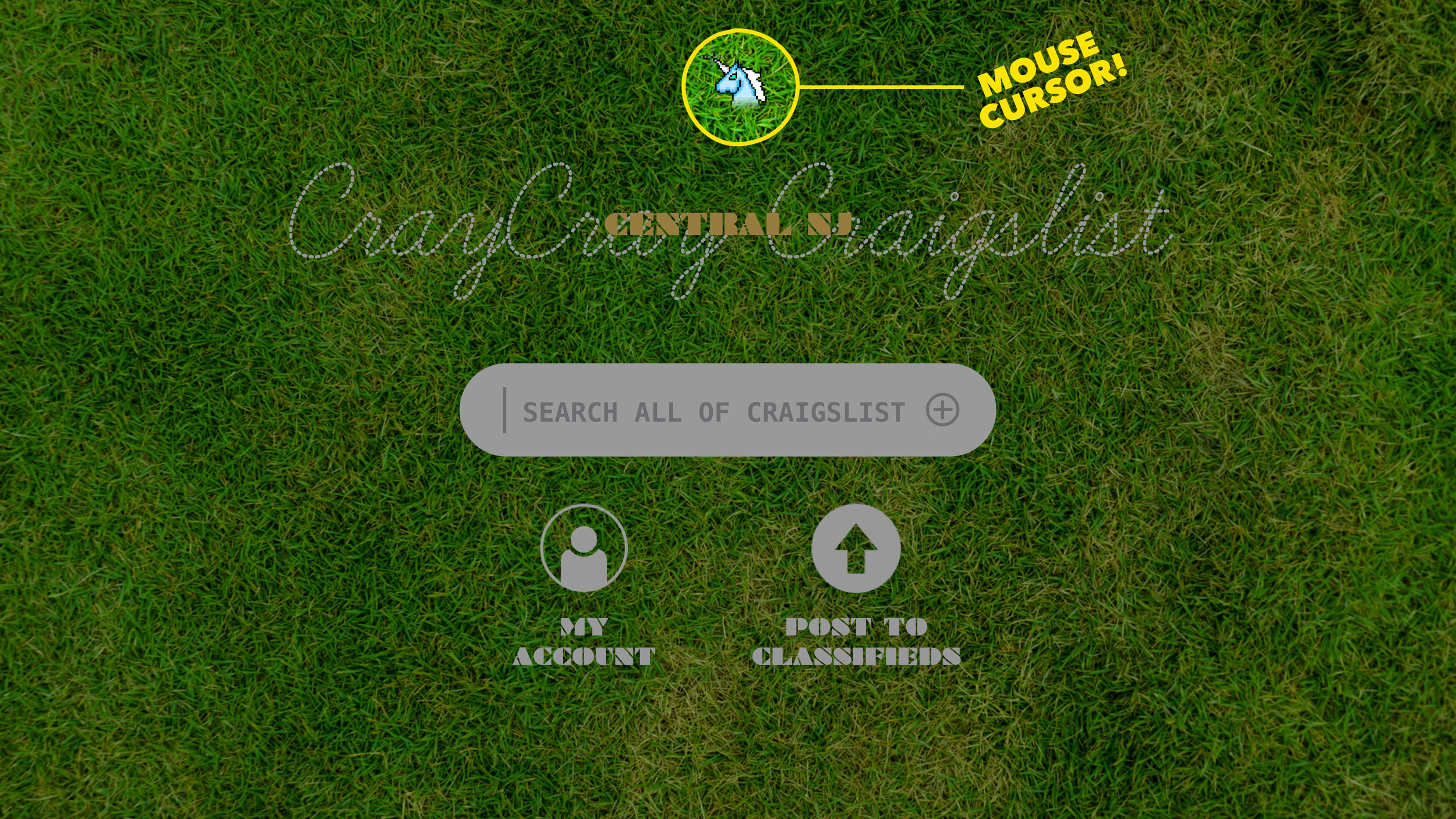
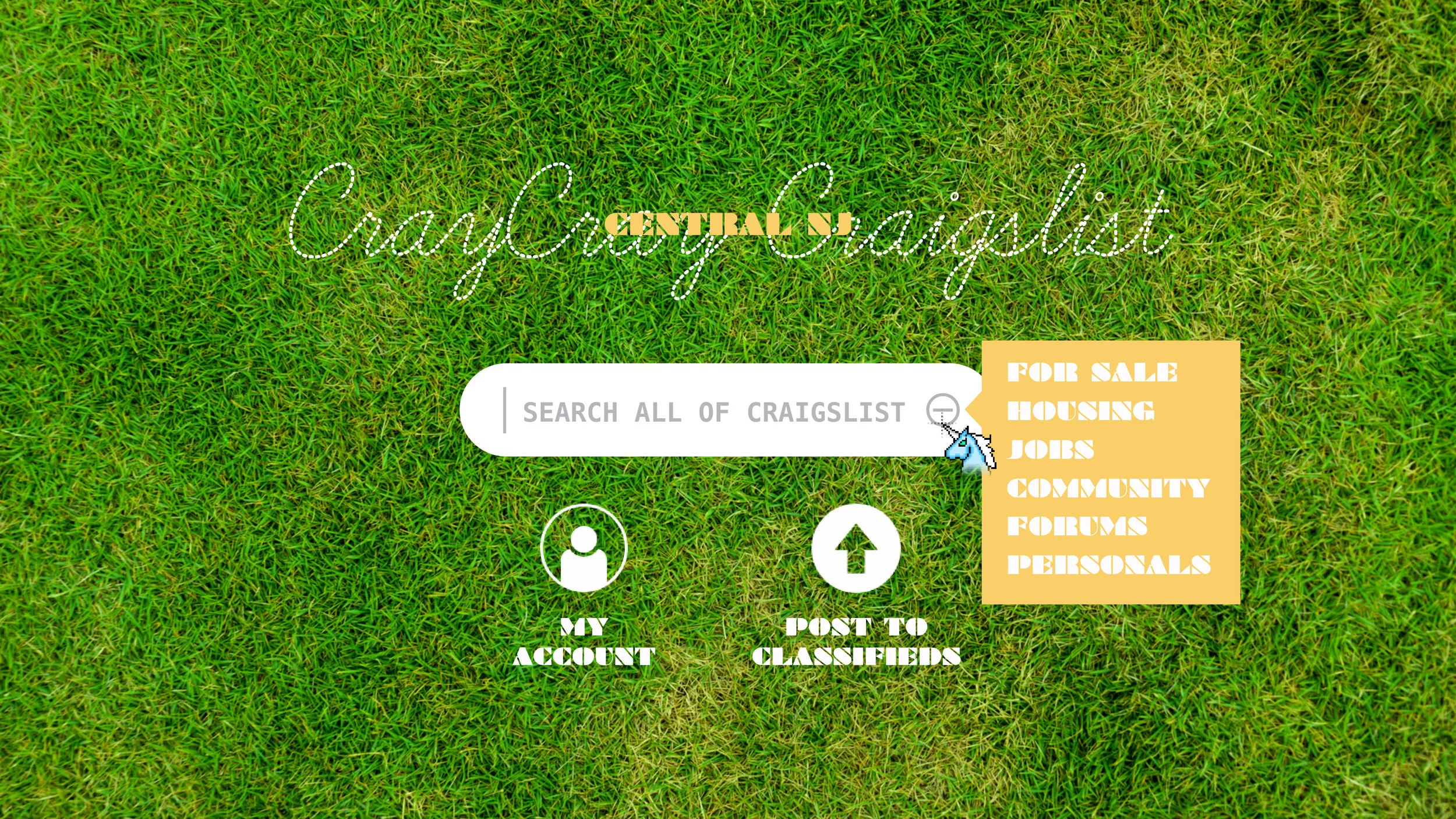
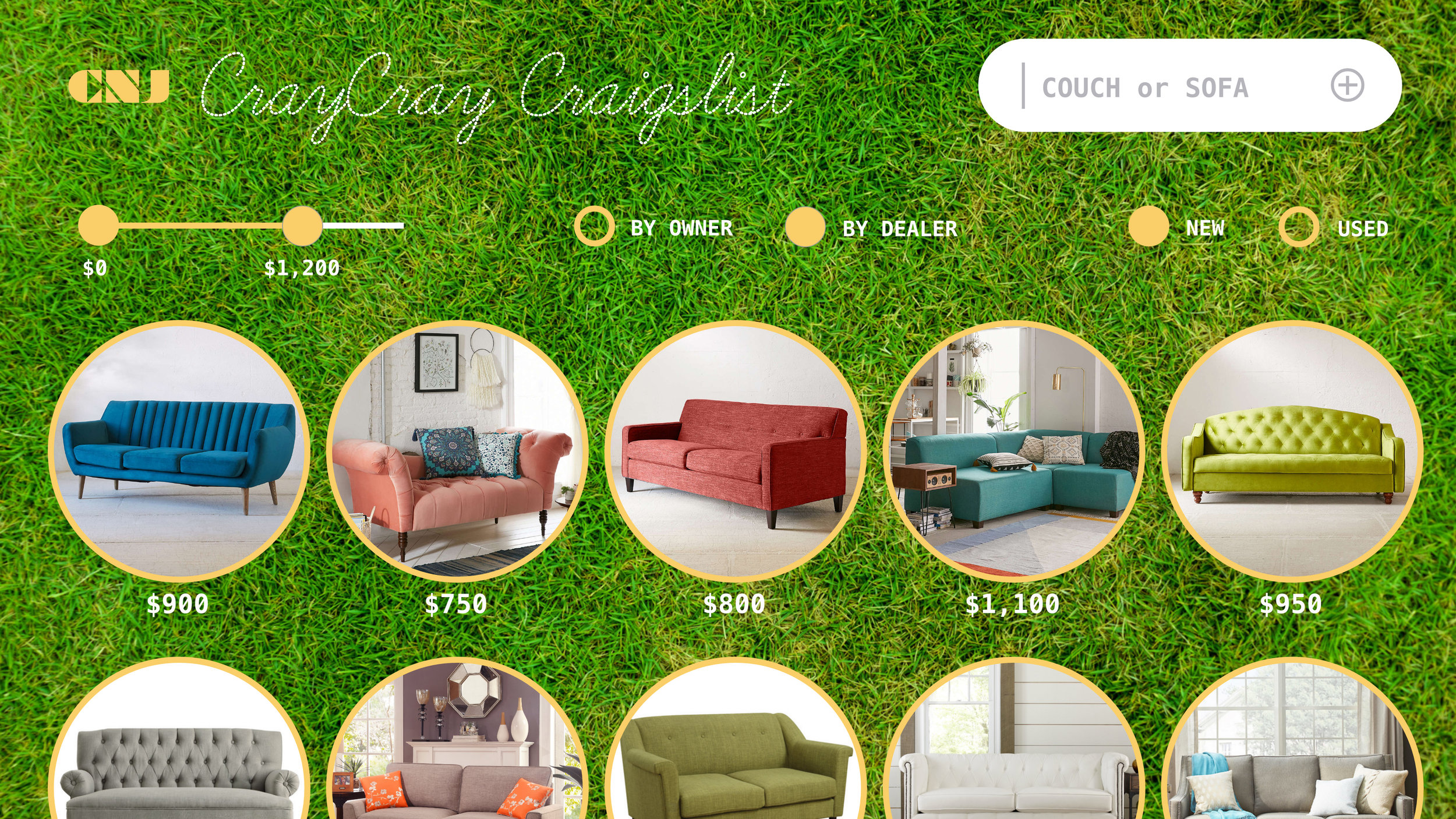
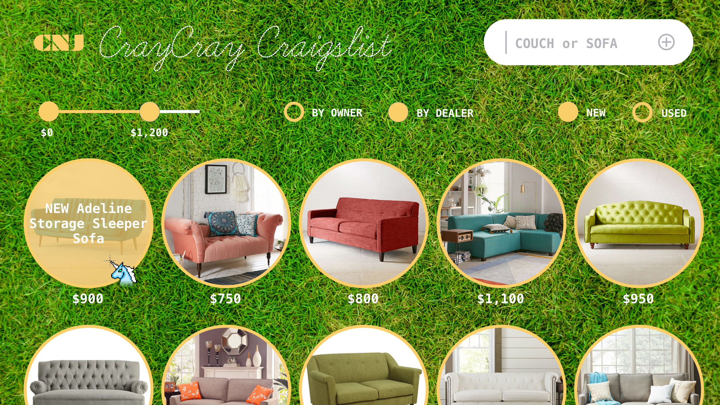
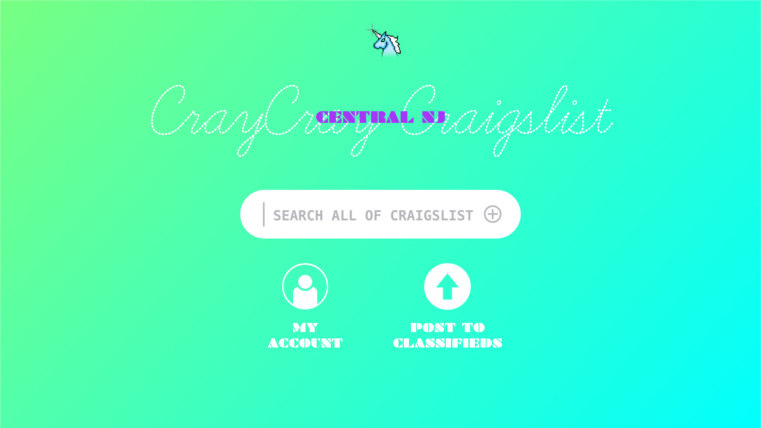
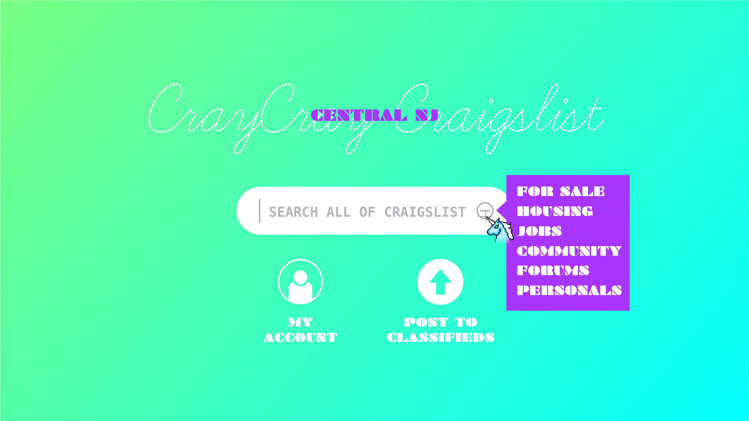
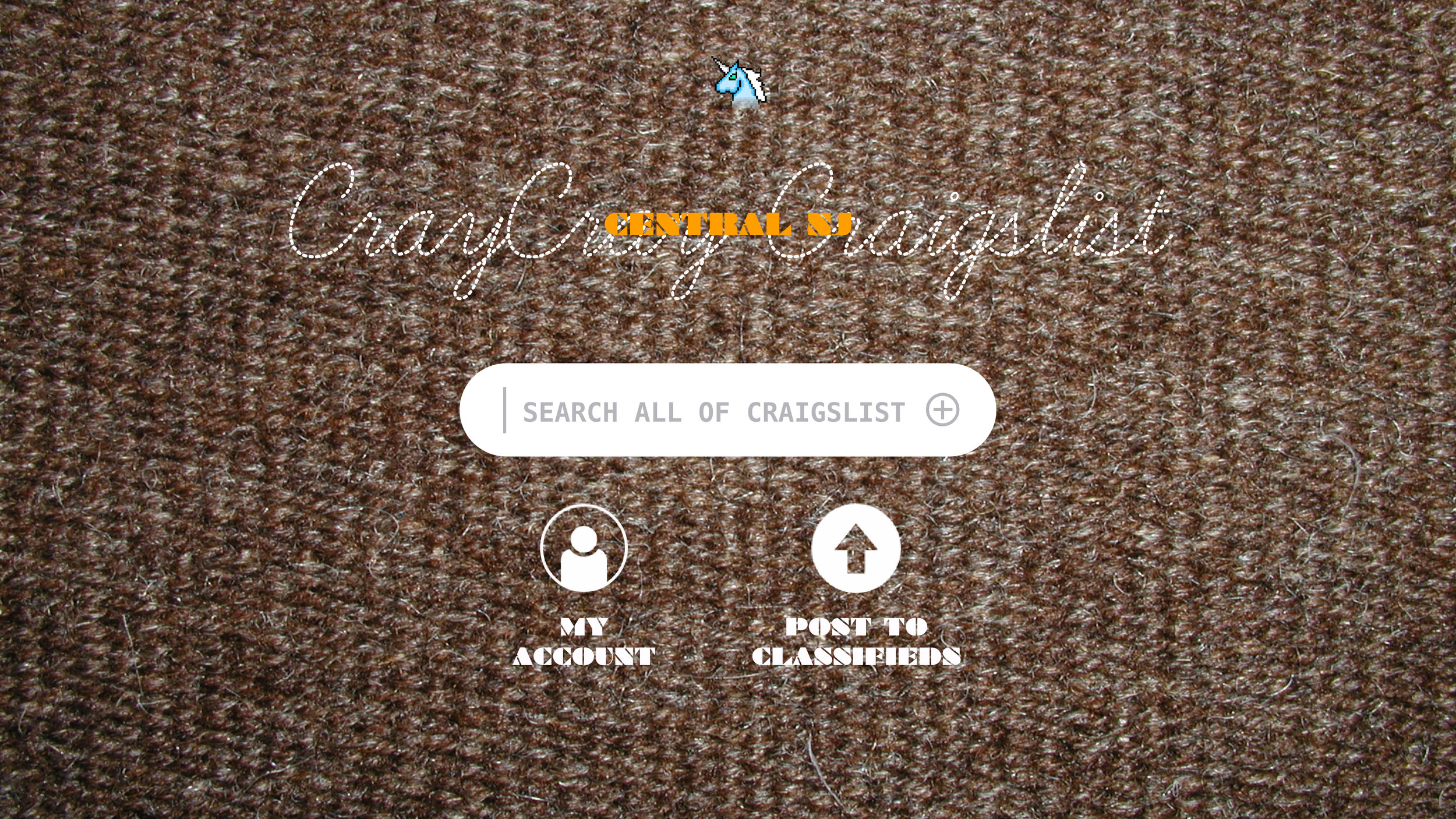
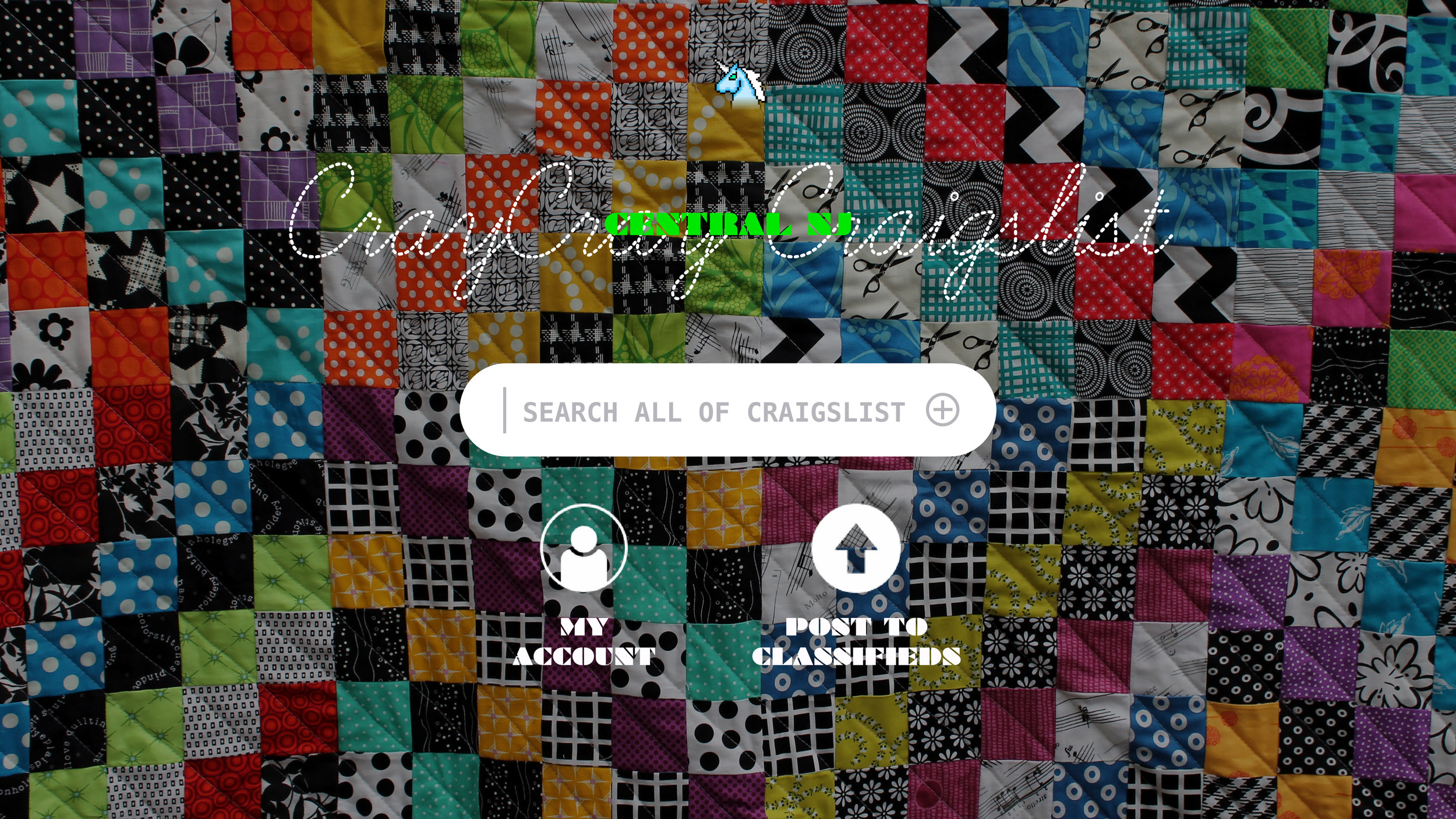
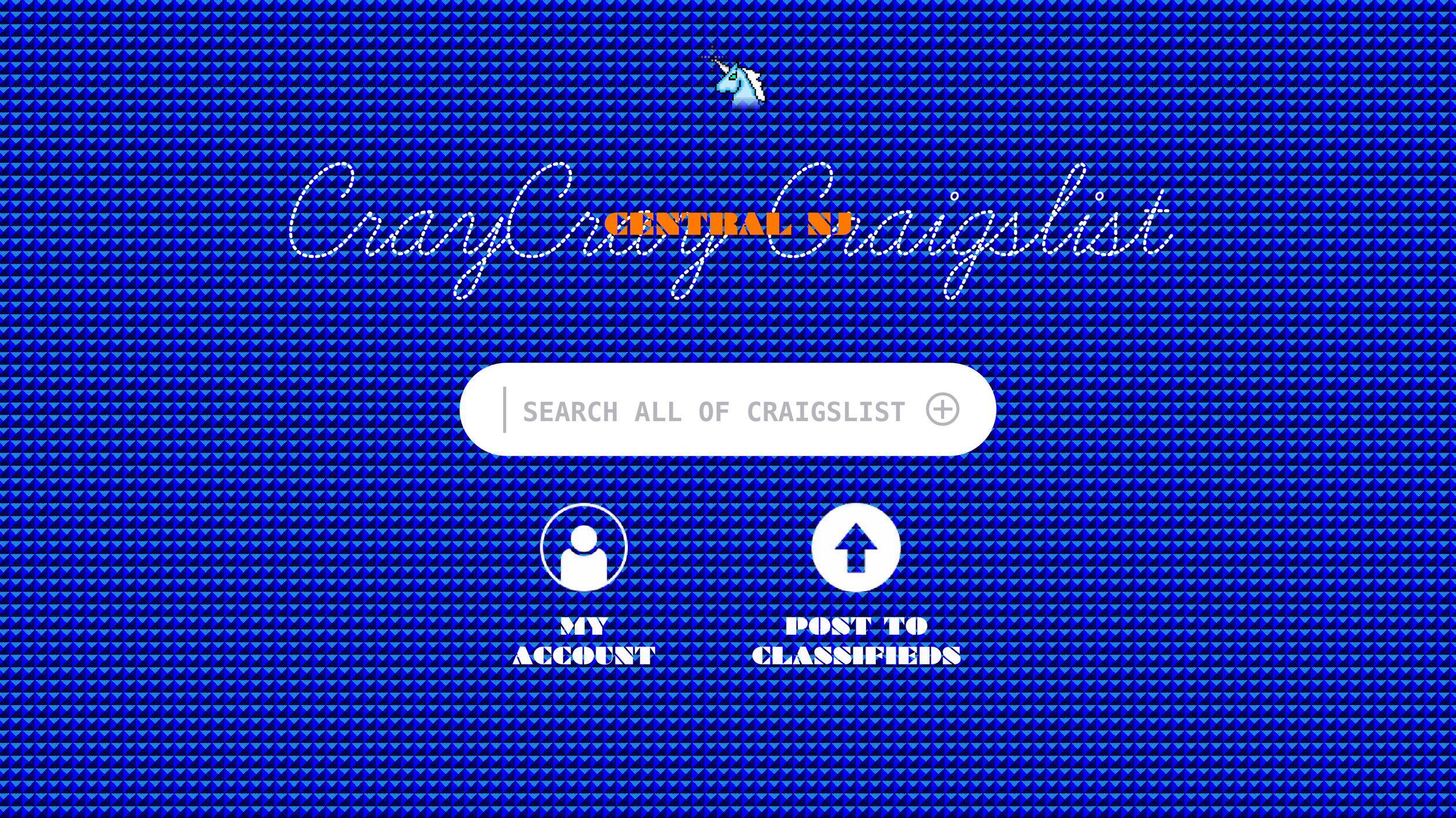
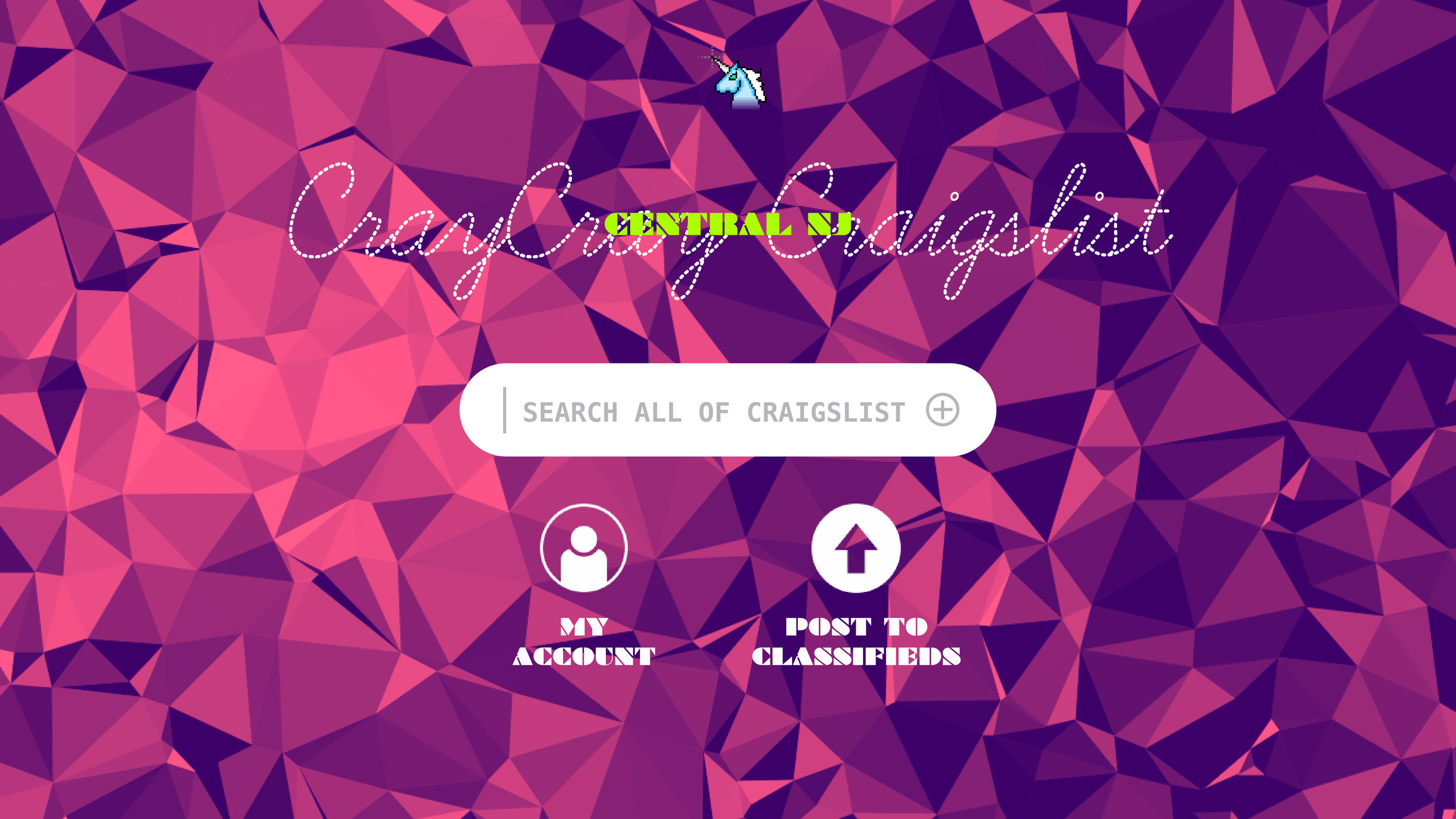
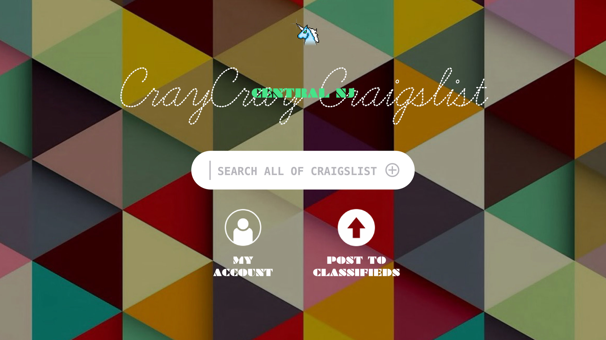
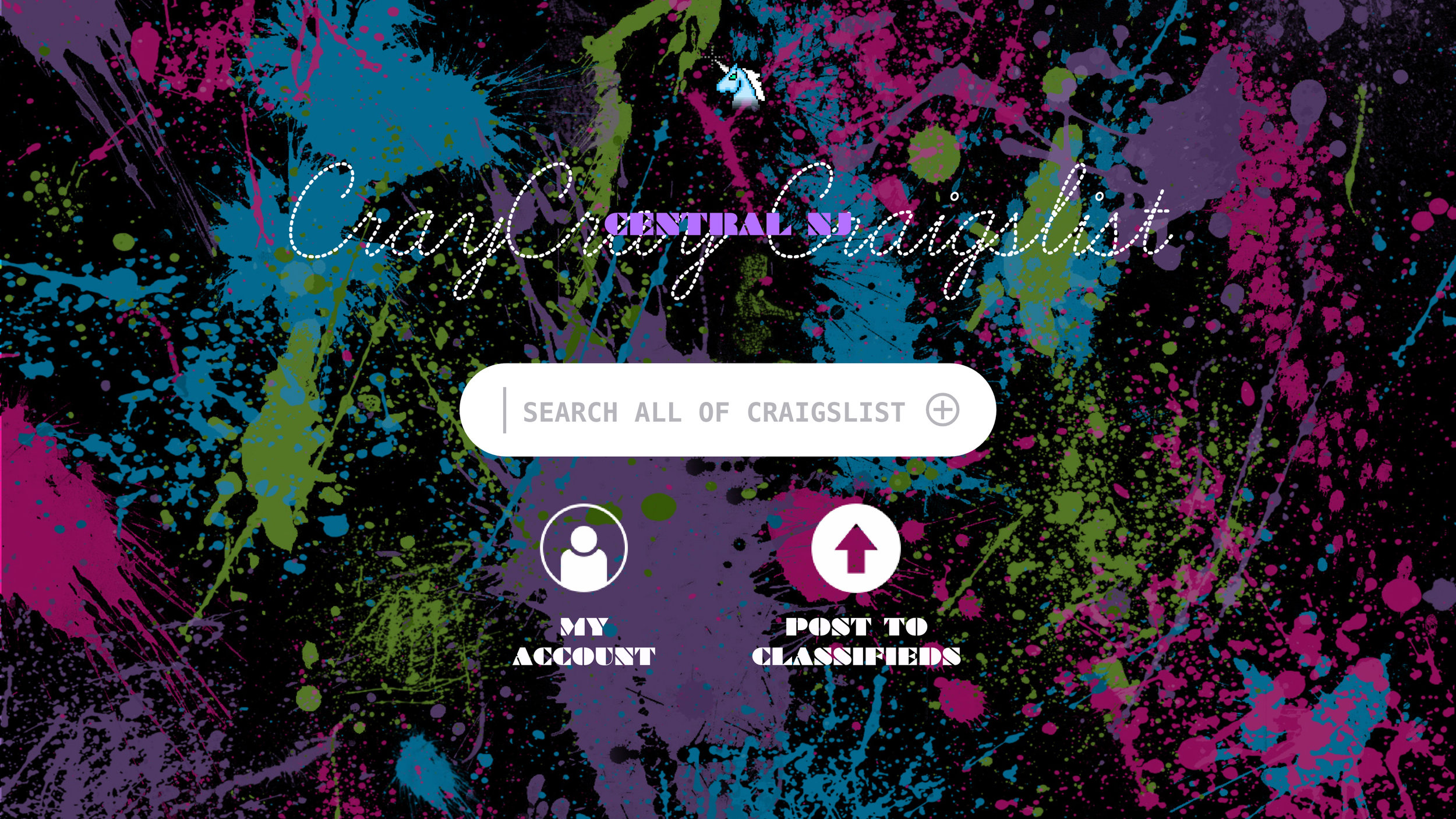
The main menu is indeed stripped down with only a search box, a login and a link to create a post. The background image randomly populates from a set of offbeat graphics along with a complementary accent color in the text and menus. The image/color combination remains in place throughout the browsing experience until the window is closed or the page is refreshed.
The lawn...